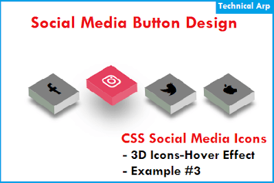
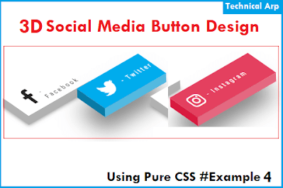
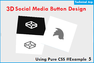
Do you want to know How to create 3D social media buttons using HTML and CSS code? I will provide a 3D facebook button or 3D Instagram Icon or any 3D social media icon using CSS. You may have seen many social media download buttons with amazing 3d Effects on download buttons. This can be easily used just by using only HTML & CSS so if you’re a beginner then you can also create 3D Effects Social Media Buttons.
Sharing Buttons like Facebook, Twitter, Instagram, Telegram, YouTube, and many more social sharing icons helps to spread your content to more visitors. If your content is found to be helpful by someone then visitors may search for social sharing options or 3D download buttons option.
 |
| top 5 3d social media buttons using HTML & CSS |
And button with 3D visualization which makes these buttons more attractive. So use below simple CSS code for Social media buttons using only HTML and CSS for beginners.
Also Learn to Create responsive tabs on the blogger website using CSS
3D Social Media Buttons CSS Design
Social Media buttons using CSS are nowadays very popular because of it's over effects and more attractive design. 3D Effect is a type of modern design consisting of three dimensions. It is much clearer and brighter than the two dimensions
So similarly 3D Effects buttons are much more attractive than normal icons so more visitors want to play with that 3D visualization.
Just by using CSS, you can make a normal button with great animation, So I will be sharing the HTML and CSS Source code of the Top 5 Social media buttons using HTML and CSS for the websites.
3D Animation Social Media Icons Source Code
To create these animated social media buttons using CSS, you can download use the required HTML and CSS code from the below code section. Copy the structure below and add it to your HTML file of the website.
You can add or replace<a href="#"> tag inside each button to redirect the user to your social network site/account on a button click. Scroll download for source codes and these Social Media Buttons in your HTML pages, websites, and projects.
You may also like the 404 error page HTML template download
Simple 3D Effect & Shadow effect social media Icon CSS design
	<!DOCTYPE html>
<html lang="en" dir="ltr">
   <head>
      <meta charset="utf-8">
      <title>3D Social Media Buttons</title>
      <link rel="stylesheet" href="style.css">
      <link rel="stylesheet" href="https://cdnjs.cloudflare.com/ajax/libs/font-awesome/5.15.3/css/all.min.css"/>

	  <style>
	  /* If you don't want below font-style then remove it*/
  @import url('https://fonts.googleapis.com/css?family=Poppins:400,500,600,700&display=swap');

*{
  margin: 0;
  padding: 0;
  box-sizing: border-box;
  font-family: 'Poppins', sans-serif;
}
/* Remove below html,body style if that effect your template */
html,body{
  display: grid;
  height: 100%;
  place-items: center;
}

.buttons{
  display: flex;
  width: 500px;
  height: 300px;
  align-items: center;
  justify-content: space-around;
}
.buttons .row{
  display: block;
 margin-left: 60px;
}
.buttons .row button{
  position: relative;
  display: block;
  height: 55px;
  width: 150px;
  margin: 40px 0;
  color: #fff;
  font-size: 20px;
  font-weight: 500;
  text-shadow: 0px -1px 0px rgba(0,0,0,0.4);
  cursor: pointer;
  border: none;
  outline: none;
  border-radius: 0 5px 5px 0;
  transition: all 0s ease-out;
}
.row button:active{
  top: 3px;
}
.row button.facebook,
.row button.facebook span{
  background: #3B5999;
  border-left: 1px solid #2E4476;
  box-shadow: 0px 5px 0px 0px #2E4476;
}
.row button.facebook:active{
  box-shadow: 0px 2px 0px 0px #2E4476;
}
.row button.twitter,
.row button.twitter span{
  background: #46C1F6;
  border-left: 1px solid #269BD0;
  box-shadow: 0px 5px 0px 0px #269BD0;
}
.row button.twitter:active{
  box-shadow: 0px 2px 0px 0px #269BD0;
}
.row button.instagram,
.row button.instagram span{
  background: #e1306c;
  border-left: 1px solid #c91d56;
  box-shadow: 0px 5px 0px 0px #c91d56;
}
.row button.instagram:active{
  box-shadow: 0px 2px 0px 0px #c91d56;
}
.row button.youtube,
.row button.youtube span{
  background: #DE463B;
  border-left: 1px solid #C02B21;
  box-shadow: 0px 5px 0px 0px #C02B21;
}
.row button.youtube:active{
  box-shadow: 0px 2px 0px 0px #C02B21;
}
.row button span{
  position: absolute;
  height: 55px;
  width: 60px;
  top: 0;
  left: -60px;
  line-height: 55px;
  font-size: 25px;
  display: block;
  font-weight: normal;
  border-radius: 5px 0 0 5px;
}
.row button:active span{
  top: -3px;
}
.row button.facebook span{
  border-right: 1px solid #2E4476;
}
.row button.twitter span{
  border-right: 1px solid #269BD0;
}
.row button.instagram span{
  border-right: 1px solid #c91d56;
}
.row button.youtube span{
  border-right: 1px solid #C02B21;
}
.row button.facebook:active span{
  box-shadow: 0px 5px 0px 0px #2E4476,
              6px 4px 2px rgba(0,0,0,0.3);
}
.row button.twitter:active span{
  box-shadow: 0px 5px 0px 0px #269BD0,
              6px 4px 2px rgba(0,0,0,0.3);
}
.row button.instagram:active span{
  box-shadow: 0px 5px 0px 0px #c91d56,
              6px 4px 2px rgba(0,0,0,0.3);
}
.row button.youtube:active span{
  box-shadow: 0px 5px 0px 0px #C02B21,
              6px 4px 2px rgba(0,0,0,0.3);
}
	  </style>
   </head>
   <body>
      <div class="buttons">
         <div class="row">
            <button class="facebook">
            <span><i class="fab fa-facebook-f"></i></span>
            Facebook</button>
            <button class="instagram">
            <span><i class="fab fa-instagram"></i></span>
            Instagram</button>
         </div>
         <div class="row">
            <button class="twitter">
            <span><i class="fab fa-twitter"></i></span>
            Twitter</button>
            <button class="youtube">
            <span><i class="fab fa-youtube"></i></span>
            YouTube</button>
         </div>
      </div>
   </body>
</html>
Layer Effect and 3D Hover Effect Social Media Buttons Using Pure CSS
Amazing Layer effect button using pure CSS only from codepen. Copy below the complete HTML code to add to your website.
 |
| layer effect 3D Hover effect social media buttons using css |
Click for Codepen code by Nour Ibram
Social media buttons with cool hover 3D animation CSS code
 |
| social media buttons with cool hover 3d animation css code |
Demo and Code by Sweety Codepen
3D social media buttons CSS animation source code
 |
| 3D social media buttons css animation source code |
Code and Demo by Stockin codepen
3D Transforms Social Media Icons
 |
| 3D transforms social media icons css code |
Codepen Demo and Code by Daniel Gonzalez
Now time for the conclusion
In conclusion of Top 5 3D Social Media Buttons Using HTML & CSS source code
So finally I shared the top 5 social media buttons using CSS 3D animation effects source codepen. I hope it was helpful for you to create this social media button. If you have any difficulty or want more such CSS design then please comment down.
See you in a new blog post.
Want to increase website speed know about Minify CSS and JavaScript in Blogger
We are providing you with many amazing scripts and tutorials for free, So please follow us on YouTube Channel to get all updates and more useful content.
Thanks for Visiting: Follow by Email and Bookmark Our Technical Arp Website for more such useful scripts.
Read more:
Add Table of Content in Blogger
YouTube video downloader script
Love calculator script for blogger


2 comments
Click here for commentshow can I check the word count of my blog??
Reply@Sam Parker - hello sir, Thanks for your comment - You can search word counter tool in our website to get script and make your own tool like this - https://www.technicalarp.com/p/word-counter-tool-blogger.html
Replyhope you like this.
ConversionConversion EmoticonEmoticon